

Roadside Assistance for Verizon Family
Providing reliable roadside assistance and driving measurable business impact
The Verizon Family app needed a more intuitive roadside assistance feature to replace the underperforming 'Hum' app. 'Hum' suffered from a confusing request process, unclear error messaging, and limited service support—leading to poor customer satisfaction and increased churn. These issues created a sense of unreliability, especially in critical moments, damaging users’ trust.
PROBLEM
The Roadside Assistance feature aimed to provide peace of mind, safety, and convenience for Verizon Family users. By offering reliable support during emergencies, the feature directly addressed user needs and strengthened the app’s position as a trusted family safety solution. This integration enhanced the app’s value proposition, fostering long-term trust by ensuring users could easily access assistance when needed.
OPPORTUNITY
As the senior designer and lead, I collaborated with cross-functional teams—including product, engineering, content, and user research—to develop and iterate on this feature. It provided comprehensive assistance options such as tire changes, lockouts, fuel delivery, jumpstarts, and towing, along with vehicle management tools, a clear onboarding experience, and the ability to track requests and limits. The design focused on scalability to support future features, ensuring long-term user trust and convenience.
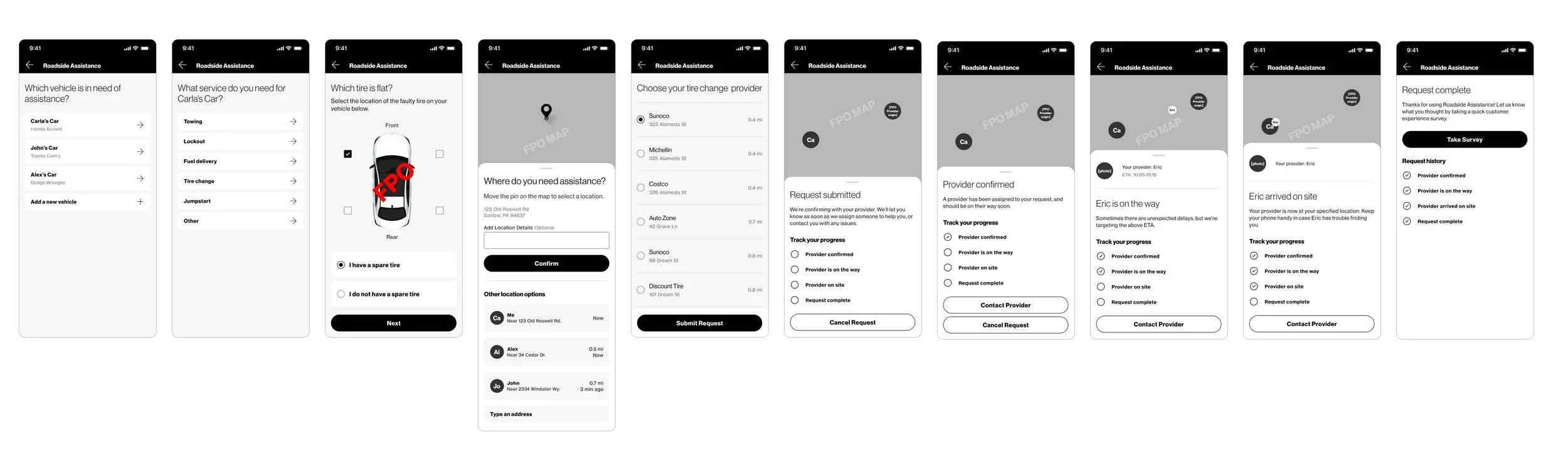
SOLUTION
Research & discovery
Before beginning any design work for Roadside Assistance, I analyzed the existing 'Hum' app and conducted a competitive analysis to identify areas for improvement. Reviewing past user feedback and app store comments highlighted key pain points, such as a confusing request process, unclear error messages, and limited service options for users assisting family members. A closer look at leading roadside assistance apps revealed best practices like clear service options, transparent status updates, and easy-to-use interfaces These insights shaped the designs, leading to simplified service requests, real-time tracking, and clearer error messages, ultimately creating a smoother, more user-friendly experience.

User flows
After conducting a competitive analysis, I mapped out the user flow to gain buy-in from product and engineering partners, ensuring alignment on key features and user needs. This collaborative effort helped clarify the design direction, address potential challenges early, and set a solid foundation for the development process.

Wireframes & designs
Once aligned on the flow, I created wireframes to capture the design vision, iterating based on feedback to develop high-fidelity designs optimized for accessibility and ease of use. I began by designing and refining the tire change flow, resolving issues and perfecting the experience before expanding to other service requests like lockouts, jumpstarts, and towing. This iterative approach allowed the team to focus on the details of one flow before scaling, ensuring a consistent user experience across all services.

Usability testing
To validate the designs, I collaborated with the user research team to conduct 60-minute, one-on-one moderated sessions with five participants, consisting of Verizon Family guardians and primary account owners representing a mix of genders, ages, and incomes.
Participants found enrolling, enabling, and requesting services straightforward. However, testing highlighted the need for more detailed information to address potential issues and reduce frustration, particularly around error states like unavailable providers, unserviceable locations, feature unavailability, and vehicle weight limit restrictions for towing.
“We don’t have AAA right now; I like the security of having [Roadside Assistance]. You never know where you’ll be when you have trouble.”
Next steps
Leveraging the insights from testing, the team and I collaborated with UX content to improve error handling and incorporate clearer status updates. After transitioning to a new project, another designer continued refining the error messaging and implementing these improvements.
Impact & outcomes
Roadside Assistance launched alongside another safety feature, Safe Walk, and contributed to significant post-launch improvements. Net Promoter Score (NPS) rose by an average of 172.46% across Android and iOS devices, churn was reduced by 4.26% (from 1.79% to -2.47%), and monthly subscriber growth increased from 782k to 812k. The app's rating also improved from 3.8 to 4.8. These results demonstrated increased customer satisfaction, loyalty, and app usability.

